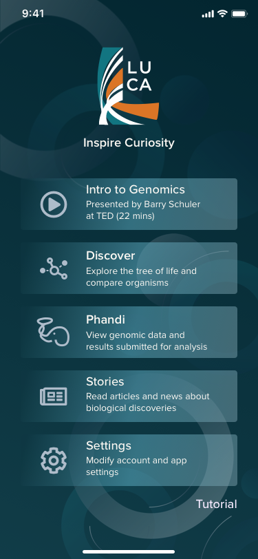
LUCA
Genomics data visualization for the rest of us
See Case StudyProject details
- Domain Research
- User Interview
- Affinity Map
- Design Inception
- Moodboard
- Hi-fi Prototype
- Presentation Slides
Koonkie Cloud Services designs algorithms, pipelines, and analytical platforms to help clients understand, get insights, and manage genomic data. Rather than spending months compiling and analyzing data, Koonkie does it in hours, delivered with their Phandi platform, ready for publication or commercialization.
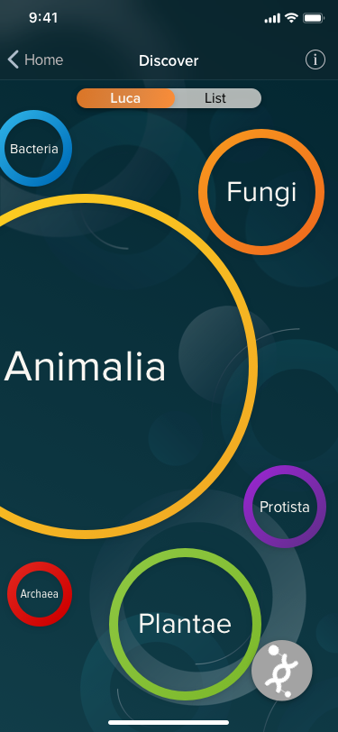
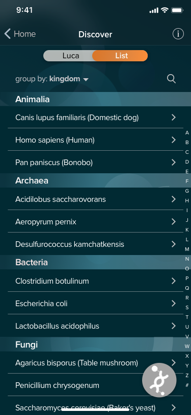
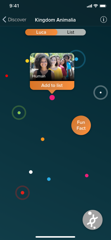
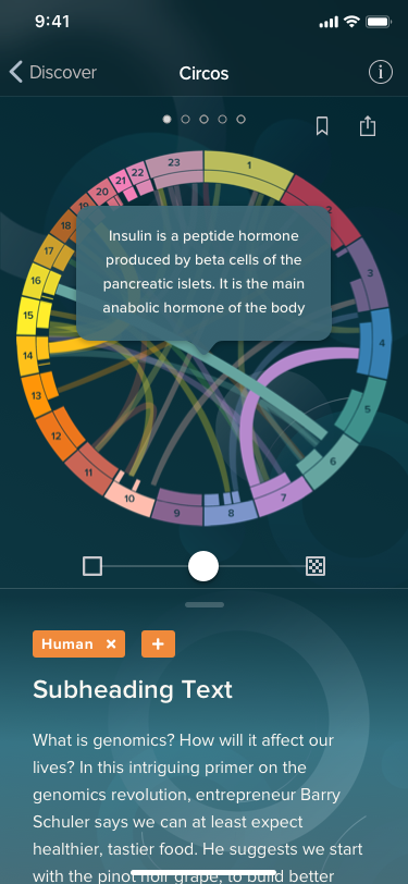
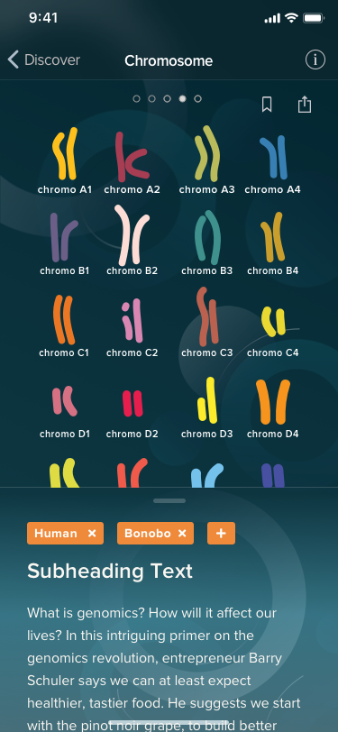
Koonkie wants to get the public interested in genomics, but information found online about this topic is too technical for casual users to understand. It is also not very visually appealing and interactive. We want the app to educate and inspire high schoolers and professionals about genomics and bioinformatics by providing simplified views, relatable fun facts, and artistic visuals.
To ease users into genomics, we included different levels of detail for diagrams, chose taxonomic classification methods that use familiar terms to give users some grounding, and sacrificed accuracy for simplicity.
For the design, we wanted to play with rounded, organic shapes that are colourful, glowing, and fluid. This will create a lively and friendly feeling. We went with Proxima Nova for the font as it works well with the rounded design and also for diagrams where labels are small.
The team came up with two logos, one for the LUCA app and the other for their Phandi platform. The LUCA logo uses the stripes from a Circos diagram as a texture. The colours used in the logo are the background and accent colours used throughout the app. The Phandi logo was meant to be an elephant with a trunk that turns into a lasso. However, through a few iterations, it began to symbolize a lot more.