Type Spec
Proxima Nova: Helvetica for the 21st century
See Case StudyProject details
- Domain Research
- Affinity Map
- Design Inception
- Moodboard
- UI Sketches
- Hi-fi Mockup
- Presentation Slides
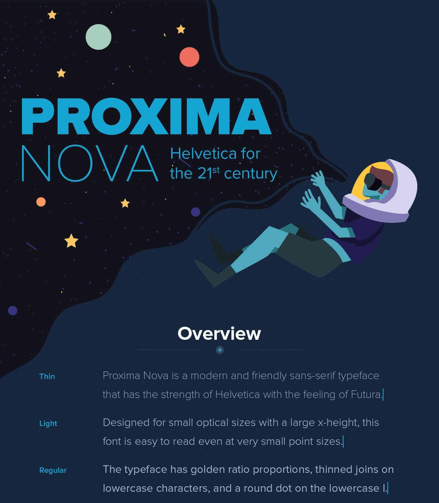
I created a type specimen for Proxima Nova as a way to get introduced to the various intricacies of type. For example, how certain glyphs are styled and kerned can give different feelings, improve readability, and look more “perfect” compared to alternatives.
I went with Proxima Nova as it is a modern and versatile font that is also very popular for websites. It also has this cool space vibe that I got from the author's type specimen document.
For the design, I went for a modern, semi-casual, slightly geometric look with an accent colour that pops against a dark background. I also want it to include illustrations to make it look like a modern magazine or landing page.
The layout is designed to suit Millennials with a straight to the point and “Show, don't tell” approach. As such, the overview showing the font weights, widths, font pairings, and pricing came first. To save space, the text showing the font weights talks about the font. All the history items are accompanied with relevant illustrations for visual interest and the text showing the typeface features are taken from the Apollo 11 transcript for that space vibe.
